
UWP Sticky Header
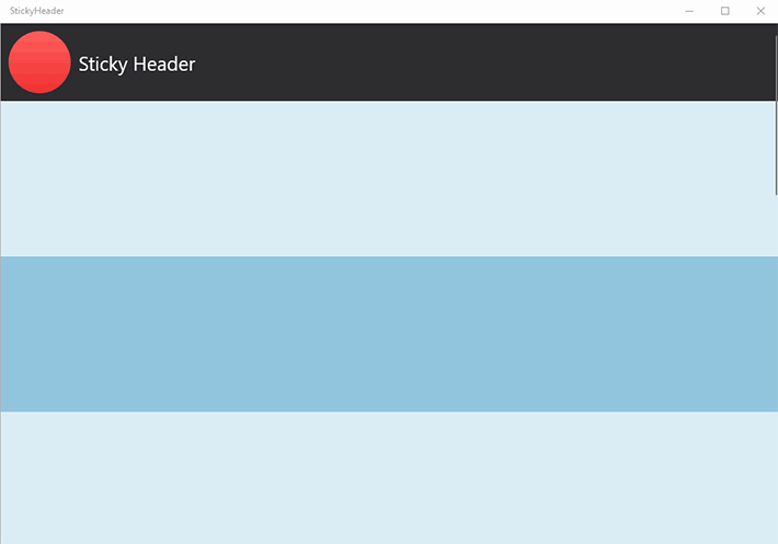
Table Of Content
A Familiar UX
When thinking about user navigation we often look at the top of the page, scouting for navigation links, a menu, or a search bar somewhere in the top header.
Try playing a round of Design the Web, where you've to guess the site from its mocks, to see how many desktop applications display a prominent header at the top.
Familiarity can be good and in this post I will go over implementing a shrinking sticky header. After scrolling our page the header will shrink and remain visible, anchored at the top.
Composition Animations
To drive the scale and the position of our header elements we are going to use expression animations. The position of the main outer ScrollViewer is going to be used in our expressions to determine the progress of the other animations.
Windows 10 Creators Update introduced ManipulationPropertySet, a special type of CompositionPropertySet that exposes the properties in a ScrollViewer. To see how far down we've scrolled we can simply read the Translation.Y value from the set. You can access the ManipulationPropertySet of other controls like (i.e. ListView, GridView, etc.) but for our sticky header we're going to use the main outer ScrollViewer.
Here's a prototype showing a sequential break down of the animations happening behind the scenes of our UWP app.
XAML
The XAML View will be very simple. All the content is going to be wrapped in a ScrollViewer. Inside the ScrollViewer we're going to have a Grid with 2 rows: the header and the rest of the content. Here's the XAML markup:
<ScrollViewer x:Name="MainScrollViewer" >

    <Grid x:Name="MainContentsGrid">
        <Grid.RowDefinitions>
            <RowDefinition Height="Auto" />
            <RowDefinition />
        </Grid.RowDefinitions>

        <Grid x:Name="MainContents" Grid.Row="1" >
            <StackPanel>
                <Rectangle Fill="#DAECF4" Height="200" />
                <Rectangle Fill="#91C5DD" Height="200" />
                <Rectangle Fill="#DAECF4" Height="200" />
                <Rectangle Fill="#91C5DD" Height="200" />
                <Rectangle Fill="#DAECF4" Height="200" />
                <Rectangle Fill="#91C5DD" Height="200" />
                <Rectangle Fill="#DAECF4" Height="200" />
                <Rectangle Fill="#91C5DD" Height="200" />
                <Rectangle Fill="#DAECF4" Height="200" />
                <Rectangle Fill="#91C5DD" Height="200" />
            </StackPanel>
        </Grid>

        <StackPanel x:Name="ScrollHeader">
            <StackPanel Orientation="Horizontal" Background="#2D2D30">
                <Border
                    x:Name="HeaderLogo"
                    Width="100" Height="100"
                    BorderThickness="10" >
                    <Ellipse Fill="{StaticResource HeaderLogoGradient}" />
                </Border>

                <StackPanel VerticalAlignment="Center" >
                    <TextBlock
                    x:Name="HeaderText" FontSize="25"
                    Text="Sticky Header" Foreground="#FFFFFF"/>
                </StackPanel>
            </StackPanel>
        </StackPanel>

    </Grid>
</ScrollViewer>
Lastly, add a Loaded event handler to your Page. We're going to move to the code behind next to implement the composition animations for our header.
Loaded
In our Loaded handler we've to perform the following operations
- Get the Manipulation Property Set from the MainScrollViewer
- Define an expression animation to "lock" the translation of our sticky header
- Define an expression to determine the progress of our animations based on the translation of the scroller
- Define the animations to scale or move the visual elements in our sticky header
Let's start obtaining the Manipulation Property Set and defining our progress expression: we want the animations to go from 0 to 100% after scrolling 100 pixels. We are going to reuse the progress expression in our animations moving forward. In the case of the scroll header we're going to cap how far the element can go offscreen to only 50 pixels.
CompositionPropertySet scrollerPropertySet = ElementCompositionPreview.GetScrollViewerManipulationPropertySet(MainScrollViewer);
Compositor compositor = scrollerPropertySet.Compositor;

// Get the visual that represents our HeaderTextBlock
// And define the progress animation string
var headerVisual = ElementCompositionPreview.GetElementVisual(ScrollHeader);
String progress = "Clamp(Abs(scroller.Translation.Y) / 100.0, 0.0, 1.0)";

// Create the expression and add in our progress string.
var textExpression = compositor.CreateExpressionAnimation("Lerp(1.5, 1, " + progress + ")");
textExpression.SetReferenceParameter("scroller", scrollerPropertySet);

// Shift the header by 50 pixels when scrolling down
var offsetExpression = compositor.CreateExpressionAnimation($"-scroller.Translation.Y - {progress} * 50");
offsetExpression.SetReferenceParameter("scroller", scrollerPropertySet);
headerVisual.StartAnimation("Offset.Y", offsetExpression);
Play around with it to get a feel of what's going on. Running the app right now you'll see the vertical offset of the header is constrained when scrolling past the threshold.
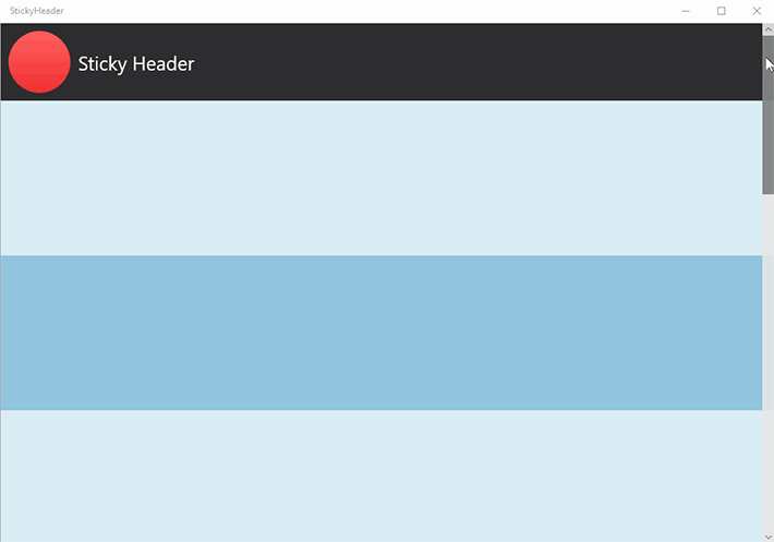
Next, we need to animate the logo. We need to change the scale as well as the position to make sure it remains centered. The top 50 pixels of the header are disappearing above the top of the page, so we'll push the logo down by the same amount.
// Logo scale and transform
var logoHeaderScaleAnimation = compositor.CreateExpressionAnimation("Lerp(Vector2(1,1), Vector2(0.5, 0.5), " + progress + ")");
logoHeaderScaleAnimation.SetReferenceParameter("scroller", scrollerPropertySet);

var logoVisual = ElementCompositionPreview.GetElementVisual(HeaderLogo);
logoVisual.StartAnimation("Scale.xy", logoHeaderScaleAnimation);

var logoVisualOffsetAnimation = compositor.CreateExpressionAnimation($"Lerp(0, 50, {progress})");
logoVisualOffsetAnimation.SetReferenceParameter("scroller", scrollerPropertySet);
logoVisual.StartAnimation("Offset.Y", logoVisualOffsetAnimation);
The last piece is the text. We're simply going to change the offset, and use a Vector3 in the expression for a change.
// Offset the header title
Visual textVisual = ElementCompositionPreview.GetElementVisual(HeaderText);
Vector3 finalOffset = new Vector3(-45, 22, 0);
var headerOffsetAnimation = compositor.CreateExpressionAnimation($"Lerp(Vector3(0,0,0), finalOffset, {progress})");
headerOffsetAnimation.SetReferenceParameter("scroller", scrollerPropertySet);
headerOffsetAnimation.SetVector3Parameter("finalOffset", finalOffset);
textVisual.StartAnimation(nameof(Visual.Offset), headerOffsetAnimation);
All set! Running the application now you can observe the sticky header.
Expression animations allow to use the state of your controls to achieve great results with just few lines of code. Hope you enjoyed this article and get to create something fun with composition animations. Check out the source code on Github and don't hesitate to reach out if you have any feedback!